Data, politics and democracy part 2: Twitter reactions to Facebooks so called ‘data leak’
Using data collected whilst the Facebook/Cambridge Analytica story was first gaining momentum, this post looks at the responses made to it via Twitter. Experimenting word embeddings and other computational methods, it aims to map key dimensions that highlight the contextual relationships between different sentiments across the dataset.
Introduction
This section of the series can be outlined as follows: First a brief rationale is given on why Twitter is being used as a site of research rather than Facebook, second analytical methods will be introduced, thirdly findings will be discussed and finally a brief conclusion will be made.
Twitter over Facebook
It is probably fitting to answer why Twitter is being used to explore an issue most concerning Facebook users. One answer is simply, because it is easier and cheaper. Another is arguably that Twitter is far more clearly configured for the expression of public sentiment.
Collection cost
It is cheaper to collect the kind of public response data in mind on Twitter rather than Facebook due to the design of their data collection services. For aggregating posts real-time, Twitter has its Streaming API which is open for anyone to use. The closest thing Facebook has to this is its Public Feed API. Access to this is restricted to a limited set of pre-approved ‘media publishers’. To access Facebook user data at scale, you must either pay, have special institutional privileges, be providing a widely-used service or pretty much trick users into sharing it with you.
What’s being shared
Regarding the character of the content created within each site, there are specific design aspects to each that could have a formative effect on what is shared. This presents differences in the usefulness of each for this investigation. On Facebook, a user principally addresses their ‘friends’. On Twitter, it’s their ‘followers’. This is reflected in among other things the default post visibility settings. Facebook asks, ‘what’s on your mind?’. Twitter asks, ‘what’s happening?’. Ultimately, the difference in what each site purveys as its uses are, Facebook is about connecting people and Twitter is about connecting people to current affairs.
Short-comings
Though it may provide means for investigating sentiment on an international scale, public posts made on Twitter are undoubtedly not a reflective sample of all public opinion, even of the opinions of all Twitter users. Though it provides large amounts of data, its quality is often hard to determine. As we will see in this section, it can be especially messy at times. These themes and other critical engagements are discussed in more detail in a previous post (Notes on Digital Methods).
For this and the reasons discussed above, though not perfect, Twitter seems like a more appropriate tool to learn about public interaction with current affairs.
Approach
Approximately 500,000 tweets were collected using Twitters streaming API between the 20th and the 23rd of March 2018, filtering for the query terms Facebook and Cambridge Anaylitica. This was just after the Guardian’s initial story was released and was gaining traction across social and broadcast media.
Along with counting hashtag frequencies and word co-occurrences, visualisations generated from word embeddings will be used to form a distant reading of the semantic relationships within the dataset. This experimentation provides a contextual overview of the response to help identify specific attributes for moving forward.
Word embeddings
Vector representations of words, or vector space models, aim to map the semantic similarity of words in continuous vector space. This has advantages over the more traditional bag-of-words model as it provides denser representations of terms. Instead of treating individual terms as unique identifiers, we can embed contextual information within them. For example, the similarities cats and kittens do and don’t have. These come in two essential styles, count based and neural embeddings. Within this investigation they will be used to compare related terms within the dataset.
The intuitions behind word embeddings depend on the distributional hypothesis, which implies that semantically similar words occur in similar contexts. As J.R. Firth summarises ’you shall know word by the company it keeps’ (1957; cited in Jurafsky, D. and James, M. 2009. p692).
Though definition of what constitutes a context can vary, in this article it will be employed in two distinct ways. One will assume context is created by a window of neighbouring words, for instance 2 either side. This will be used to build a neural model. The other will assume all words within a Tweet have a shared context and shall be used to measure co-occurrence in a count based manner.
Count based methods
For my own notes, an illustrative example is given. This example is slight variation on that provided in Grefenstette, E. 2017. The technique used in vector representations shown here also forms the basis for neural embeddings described later.
Say we target the words kitten, cat, and dog. Using the examples above and ignoring stop words (low information words like: ‘the’, ‘a’), we can list the witnessed context words for each as:
After this small example our complete set of context vocabulary would be: {cute, purred, small, furry, meowed, old, loud, barked}. Using this generated vocabulary, one way we can create a vector representation for each of our target words is as follows:
To do this we denote the presence of the context words in the order described above with either a 0 (false) or 1 (true), depending if they appear in the same context as our target word. This is useful as we can now compute the similarity between each word, for instance with cosine similarity.
(The numerator of the equation here is the dot product of the two vectors and the denominator is the product of the 2 Euclidian norms.)
Computing this, as is expected from this completely constructed example, kitten is most like cat. WOW! how did that happen? Also, because the fact that both cat and dog have old in their context, dog is more like cat than kitten.
Neural embeddings
Beyond count based methods neural embeddings have also been widely employed to predict vector representations. Using this method embeddings are normally represented by a matrix of target and context words. Two of the main modelling strategies here, are the Continuous Bag-of-words model (CBOW) and the Skip-gram model. They function in pretty much opposite ways. Here is an illustration comparing both:
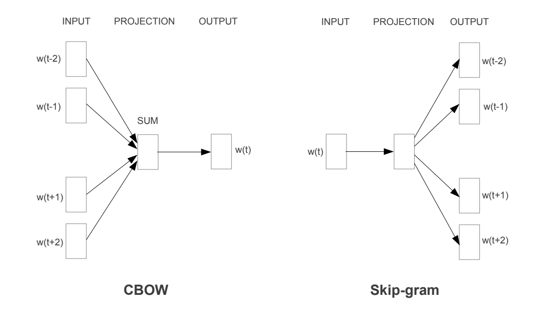 Image from: (Mikolov, T. Chen, K. et al. 2013) https://arxiv.org/abs/1301.3781
The CBOW model tries to predict the target word from a given set of context words and the Skip-gram model tries to predict the context words given a target word. In this post the Skip-gram model is used, implemented with the machine learning framework Tensorflow. This was done with reference to their demonstration word2vec_basic.py. Alterations to the original file have been made to pre-process the data differently and carry out some additional steps.
Visualising vector representations
Word vectors produce high dimensional data. To make sense of the representations visually we can project them into lower dimensional space. This will be done here using t-distributed stochastic neighbour embedding (t-SNE) implemented using the Python package Scikit-Learn.
Counting Co-occurrences
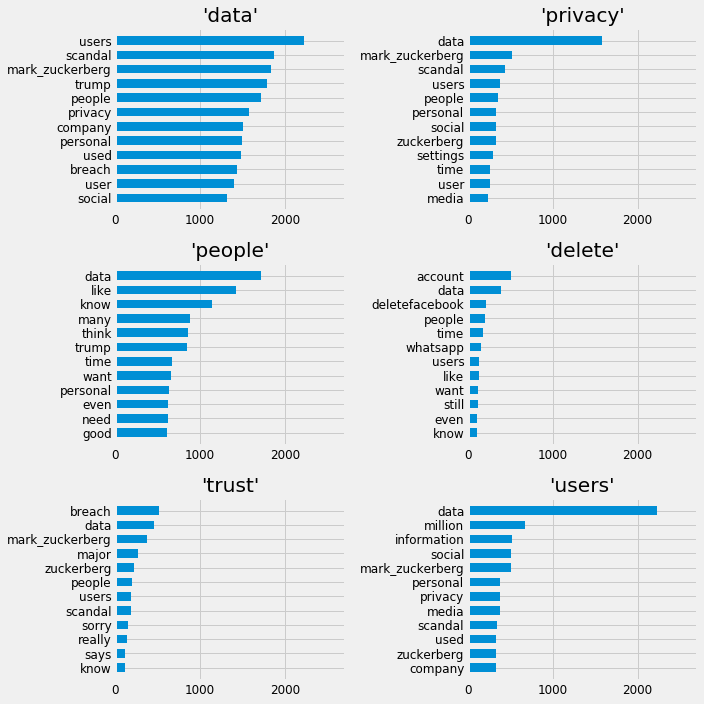
The Idea of a word co-occurrence matrix is something widely used in natural language processing. As a simple extra piece of analysis, the top co-occurrences of some terms of interest from within the dataset will be presented. The terms of interest can be described as: data, privacy, people, delete, trust, users. This is presented in a collection of bar charts.
Noise within the data
As discussed in a previous post Twitter Spam and Ham, the dataset collected here was especially noisy. As a reminder; this came in the form of spam targeting the trending topic but also the fact that tweets came from a wide variety of languages. The topic followed was an internationally discussed issue, however, it didn’t help that the query terms were organisation names instead of words belonging to the English language.
Approach summary
The methods for investigating the data here are experimental in a way that is trying to learn about methodological approaches and the data simultaneously. The main strategy being employed here is, using distributional semantics to link common terms. In doing this see what more can be understood the discussions within the sample.
Findings
Hashtags
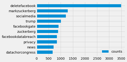
Looking at hashtag frequencies, we can see that deleteFacebook was the most popular – something that was also widely reported by news organisations. Whilst filtering spam it was noted many tweets contained nothing but this repeatedly. Some of these Tweets looked like they come from automated accounts, others more natural. This did pose some questions of trend manipulation, but after counting the document frequencies and not repeats within tweets the trend did not change. Below the top ten tags can be seen with the query terms (‘Facebook’, ‘CambridgeAnalytica’) filtered from the collection. Taking this approach there doesn’t seem to be anything too overt to help explore the topic in any new directions.
Word embeddings
Running the Tensorflow model described previously for 10,000 iterations it finished with an average loss of around 4% in predicting contexts of given terms within the training data. Evaluation of how well the model performs in practice is obviously harder to determine. The size and quality of the data put into the model is obviously not going to give a good representation of the English language. It may however have the potential to map corpora specific terms and ideas. Below is the t-SNE visualisation of the word embeddings created. Hopefully what we should expect to see is that terms that are similar end up clustering nearby each other. What is projected is also the most common 250 terms within the dataset after the removal of stopwords.
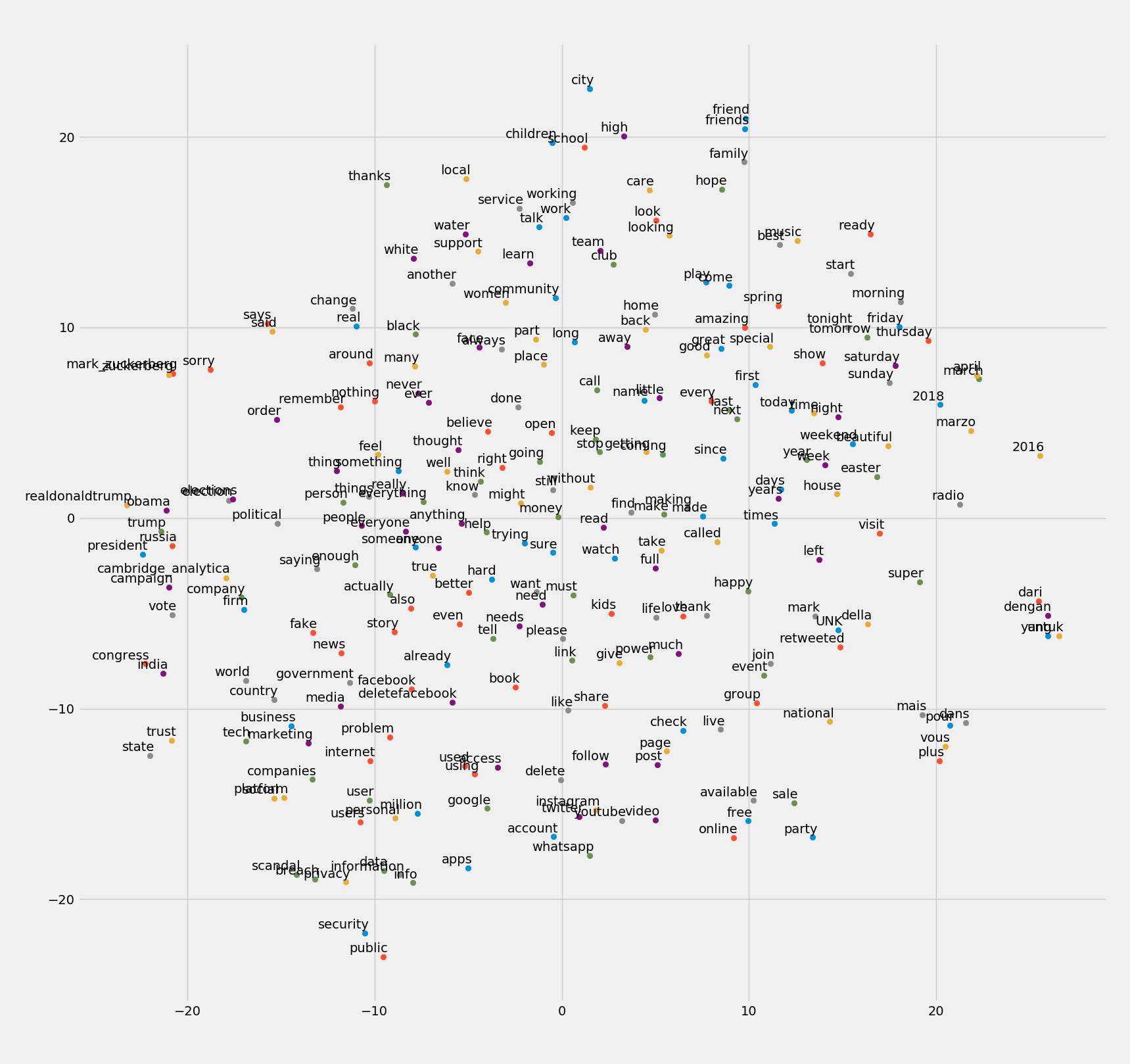
It is argued that t-SNE visualisations tend themselves to be easily misread (Wattenberg, et al., 2016), hopefully that won’t be the case here lol. Running the visualisation program several times, the intuitive understanding is, that while global positioning within the graph tends to vary somewhat, locally relevant terms produce more repeatable results. For example, the small group of un-filtered French stop words vous, mais, pour, dans always clustered. Logically French words are not likely to appear in the same context as English ones, so that seems correct. Common bigrams such as fake news, social platforms, public security seem to have clustered also. As well as variations in tense, pluralisation etc.
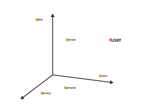
Annotating the Space
Zooming in on the bottom left of the graph seems to locate the main areas of interest in this inquiry. Qualitative annotations have been made to bring further structure to the space. This is employed as a method of communication, not classification. Being an issue centred on the use of data, dimensions presented here can be said to emerge. These can be described as: the business or the economics of data, its politics or how data is used and regulated, and the individual securities of privacies of users. These obviously overlap and are in an active state of interplay.
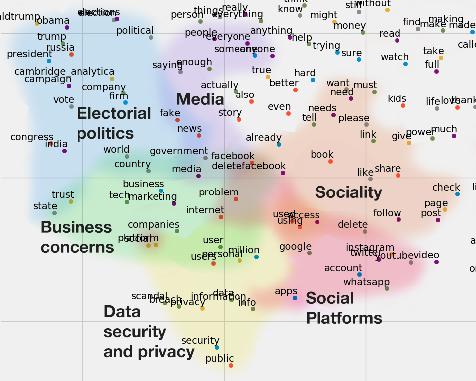
The annotation of sociality was included as it points to language use that is clustered due to the corpora being from social media. The use of words like, share, follow, post, though they have become more used generally in language, would not be as present within a book for instance. Recounting this, and the way the dataset was especially subject to spam, is a reminder that the logic social media platforms operate on doesn’t stop. Even during the expression of dissent or outrage, not only are the platforms themselves profiting from these expressions, users are also incorporating their logics to promote their own position.
Co-occurrences
The co-occurrences presented here are as expected. Utterances of trust are most common with utterances of breach. This method simply provides another perspective for visualising points of interest.
Summary
Beyond being a DIY exercise, investigating a topic through Twitter that has already been covered extensively within the news doesn’t yield much new information worth noting. We can see people are talking about a breach of trust, #deleteFacebook and the data scandal in relation to politics – as was reported. Evaluating the methods used has also provided challenges. Particularly with the neural embeddings, as in reduced dimensional space, the data in visualisations are subject to compression. Overall this has provided a way to think about the initial reactions to the topic visually and differently to other approaches that have been taken within this blog. Its results will be used for further discussion in a later post.
Read Next: Part 3: Analysis of The Guardian’s content
References
- Grefenstette, E. 2017. Lecture 2a- Word Level Semantics. [Online]. Available from: lectures/Lecture 2a- Word Level Semantics.pdf at master · oxford-cs-deepnlp-2017/lectures · GitHub
- Jurafsky, D. and James, M. 2009. Speech and Language Processing. Second Ed. London, UK: Pearson Education Ltd. (Third Ed is available here online)
- Maaten, Laurens van der, and Geoffrey Hinton. 2009. Visualizing data using t-SNE. Journal of Machine Learning Research. pp.2579-2605. [Online]. Available from:http://www.jmlr.org/papers/volume9/vandermaaten08a/vandermaaten08a.pdf
- Mikolov, T. Chen, K. et al. 2013. Efficient Estimation of Word Representations in Vector Space. [Online]. Available from: https://arxiv.org/abs/1301.3781
- Wattenberg, et al., 2016. How to Use t-SNE Effectively, Distill. [Online]. Available from: http://doi.org/10.23915/distill.00002
- Vector Representations of Words - TensorFlow
- Word2Vec Tutorial - The Skip-Gram Model · Chris McCormick
Supporting resources:
- digitalcitizens/word2vec_basic.py at master · winstonjay/digitalcitizens · GitHub
- digitalcitizens/ca_fb_notes.ipynb at master · winstonjay/digitalcitizens · GitHub
Additional reading:
- Firth, John R. “A synopsis of linguistic theory, 1930-1955.” (1957): 1-32.
- Mikolov, Tomas, et al. “Distributed representations of words and phrases and their compositionality.” Advances in neural information processing systems. 2013.
- LDA2vec: Word Embeddings in Topic Models (article) - DataCamp
- GitHub - MaxwellRebo/awesome-2vec: Curated list of 2vec-type embedding models
- Anything2Vec, or How Word2Vec Co nquered NLP