Visualising Topics
This post experiments with different ways of visualising topics within a dataset.
Introduction
In Theme Detection in Social Media Daniel Angus (2017) presents available tools for visualising textual data with the 2 software packages Leximancer and Discursis. Both tools seemed interesting, however, both were from closed source commercial projects, which was a problem. Leximancer was especially interesting, as it used a probabilistic model for generating networks of ‘concepts’ for analysis. However, only providing a 7-day free trial, I was not prepared to commit an extended period of time to understand the software in depth. Instead It seemed more fruitful to build upon previously used ‘topic extraction’ methods.
Before we continue the use of the terms ’topics’, ’concepts’ and themes, should probably be clarified. In the literature supporting Latent Dirichlet allocation (LDA) (Blei, D.M., Ng, A.Y. and Jordan, M.I. 2003) and previous analysis within this blog, use the term ‘topic’ is used to describe the probabilistic distribution across words, each word in the corpora belonging to each topic set to a varying degree. Throughout this article LDA is used whilst selecting the top n scoring words in each topic set to create topic representations. However, Leximancer’s supporting paper describes their representations that seem similar as ‘concepts’ - though looking at Daniel Angus’s table made with the software (fig 31.1. p.536), I’m not sure how the name ‘Tony Abbot’ is a concept.
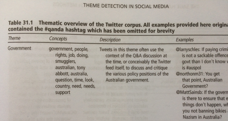
Both Angus and the Leximancer paper use the term ‘theme’ to describe the annotations that the researcher gives the presented concept sets. So, the ‘theme’ of the example above is government. This seems more fitting than what I described previously as ‘qualitative descriptions’ and will be used in the future.
For final clarification between the terms ’topics’ and ‘concepts’… they will be used interchangeably due to how Leximancer has described its product, but it’s probably better to think of both in terms of being ‘topics’. This clarification has mainly been for myself as It was getting confusing reading the different uses between papers.
The main body of this article will now consider ways of generating presentable forms of topic visualisations though my own experimentations.
Topic Table
In a previous post Finding civic discussions on Twitter - Digital Citizens, topics generated were represented in a table with descriptions of the term groups. This was straight and to the point but it didn’t articulate all the information available efficiently.
For a start, we could use the weights of each term within the topic to indicate local importance. This brings us on to our first more graphic visualisation.
Word Clouds
Though they are probably a bit overused and to be honest I don’t like them, word clouds do a good job of highlighting specific terms within a body of text. Using the feature weights from the LDA model we can scale and adjust the opacity of each topics terms to show the most prominent. This was done with a simple python program that just generates some HTML to display this. For something more transportable maybe generating an SVG would be better and not much harder.
want legal card million russian obama vote immigr deport resid question citizen path illeg appli dreamer ask citizenship provid presid democrat trump tax american daca
privat unit presid order district associ press target major polici pull today polic attorney new report repres general offic pleas state join lawsuit trump citizen
amend american arm militari need everi respons weapon pay state assault kill elect want protect constitut govern democraci nra vote peopl citizen use gun right
wrong live year world citizenship born american peopl nation class like home right uk eu great india countri work citizen make know british help dual
citizen abid good american time countri peopl senior tri want come law yes need everi make say know gun think stop right becom crimin like
Each topic set is bounded by its own box. I haven’t added annotations to describe the topics but this could also easily be done. Straight away you can see not only the most prominent terms but also more clearly the ones that occur across different topics.
Gephi Graphs
Trying to represent these connections between the topics further we can construct a network of topics linked by shared terms. Topic roots have been labeled A through E respectively. I don’t think I’ve done that great a job but here is a visualisation of this in action.
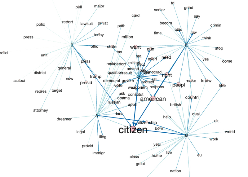
Using in-degree to increase the scale of nodes and edges differentiates the more common terms across topics. However, beyond the small directional arrows this is not fully communicating the fact that the terms belong to topics.
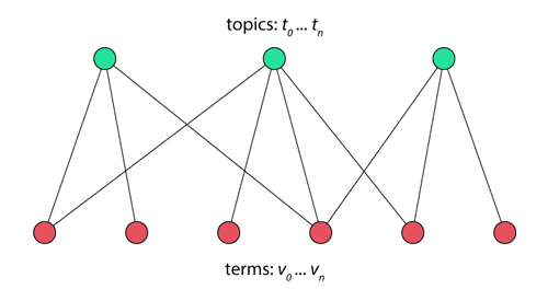
A property of the network that has been constructed is that (if my graph theory knowledge isn’t failing me) it is a bipartite graph. This means that the nodes within it can be split into two distinct sets. Presented here is the fact that that topics can only connect to terms and vice versa. This represented below in the disjointed red and green nodes.
It may also useful to represent the different types of nodes more effectively within the final network visualisation.
Though Gephi makes available a wide variety of graph algorithms and visualisations at a touch of a button, I’m not aware of any methods to share these interactively. A big problem with complex graphs is that they’re often quite messy and things overlap. The ability to adjust and move things about is often helpful.
Interactive D3.js graphs
Because of the advances in web technology it now easier than ever to make all sorts of dynamic content in websites. D3.js is a quite a popular JavaScript framework designed for manipulating HTML documents based on data. Though not providing tools to do everything for you it focuses providing a strong foundation for creating your own ‘data driven documents’. After exporting data created in a previous python program into JSON format we now have an easy and relatively fast way of creating visual representations in the browser.
Arguably we can see more clearly example information such as topic’s C and E are related by terms linked to gun control. Also, that topic B is the least connected to the rest of the topics. Differentiating between different node types as discussed previously has helped this. The obvious downside to this approach is that you must be able to code the visualisations yourself.
Now, you can merely drag nodes around a bit, it might be better to add other forms of user interactivity. Future time investments could be spent creating something like this: bP Example - Double Vertical bP with labels - bl.ocks.org as an improvement to the graphs constructed here. As well as this, combinations of tools could be used together. For example, if it is difficult to implement or find specific graph algorithms, Gephi could be used to generate this.
Considerations
TODO
Conclusion
This has been a start to thinking about representing topics/themes within text visually. It is by no means comprehensive and the methods shown here can be improved on. These approaches would be beneficial in communicating data in future projects. How this will be done obviously depends on the nature of both the nature of the data analysed and of the idea being communicated.
References
- Angus, 2017. Theme Detection in Social Media. In: Sloan, L. and Quan-Haase, A. ed. The SAGE Handbook of Social Media Research Methods. London U.K: SAGE Publications. pp.530-544.
- A. E. Smith and M. S. Humphreys. 2006. Evaluation of Unsupervised Semantic Mapping of Natural Language with Leximancer Concept Mapping. Behaviour Research Methods, 38 (2), 262-279. Science — Leximancer
- http://www.jmlr.org/papers/volume3/blei03a/blei03a.pdf